university 3rd year project: jetfuel

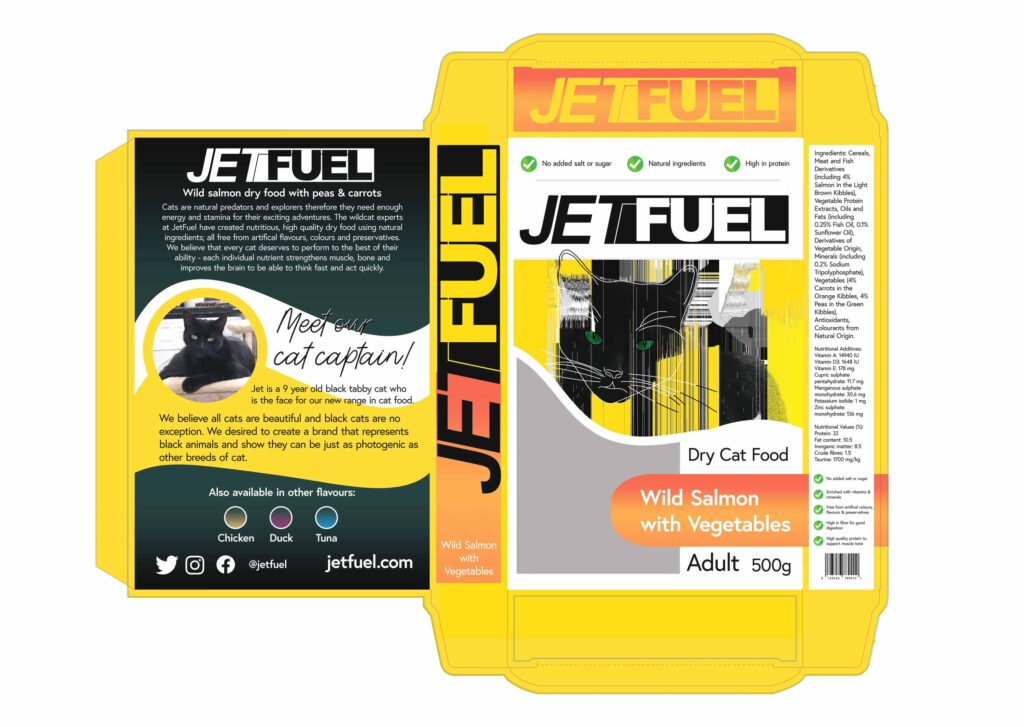
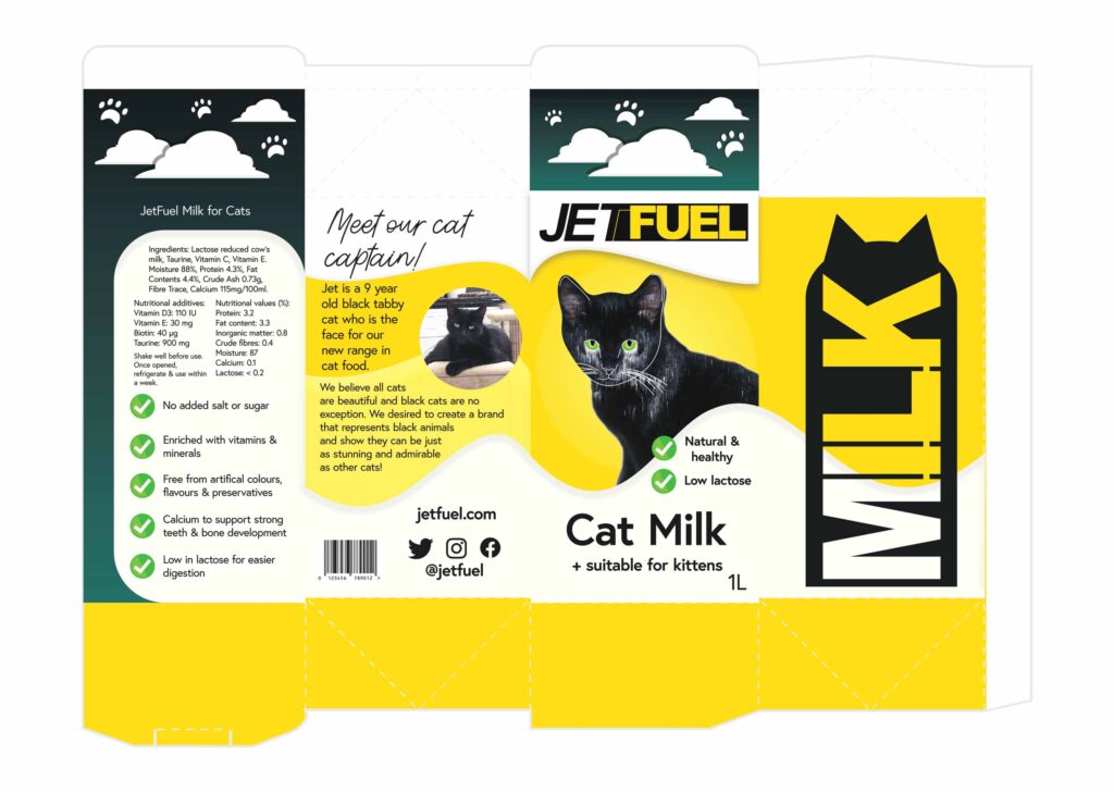
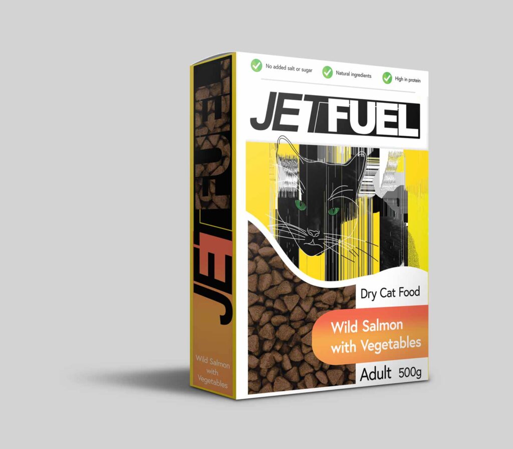
JetFuel was a 3rd year final project in university. I chose to explore the pet food industry and understand why black animals aren’t represented as other colour breeds. I was inspired by my own lovely
black cat to create a pet food range using photography and illustration, using him as an ambassador for my brand. The range covers kitten milk to senior food. The unique aspect of my products
were the windows in the box and milk carton which were created to display the quantity left. This is shown through a custom shaped window and the logo on the milk carton.
bbc gardeners’ world book cover project
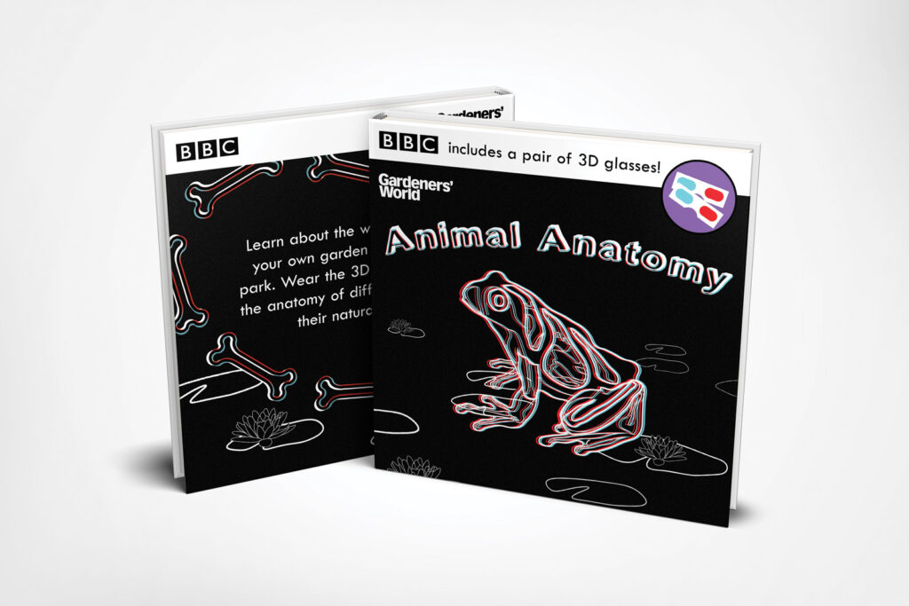
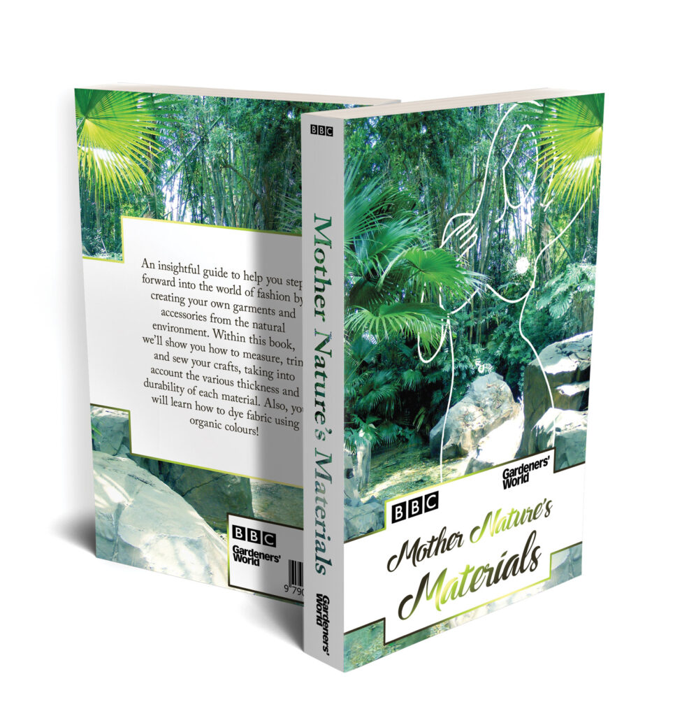
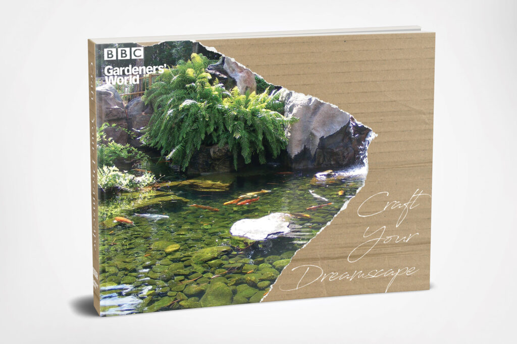
This was a third year brief by BBC Gardeners’ World to create books aimed at three different age categories.
Animal Anatomy was designed for children to encourage them to learn more about wildlife, using 3D glasses to interact with the drawings within the book.
Mother Nature’s Materials was aimed at young adults being more conscious about sustainability and fashion.
Craft Your Dreamscape was aimed for those who have retired to be able to create their dream garden.
if i knew then what i know now
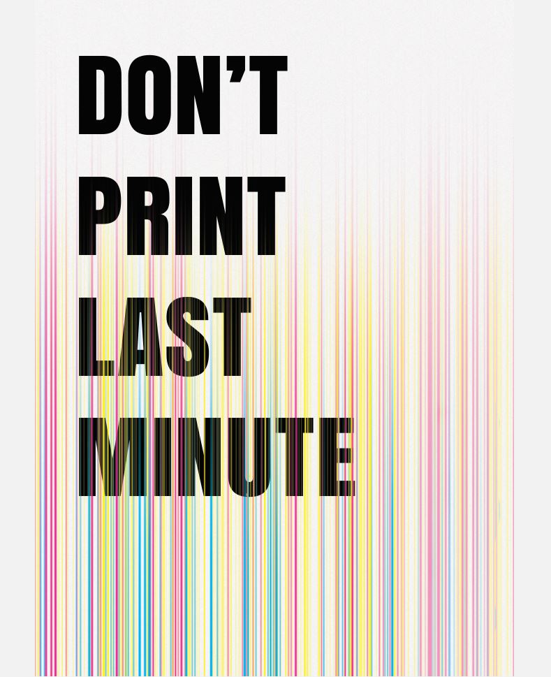
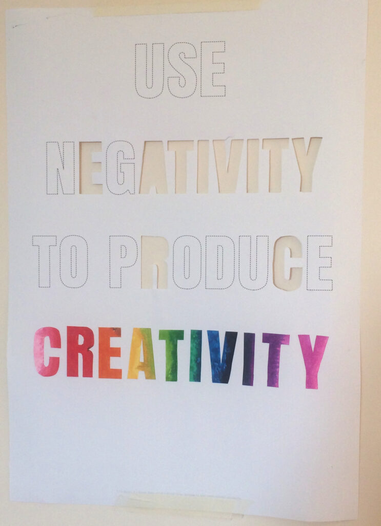
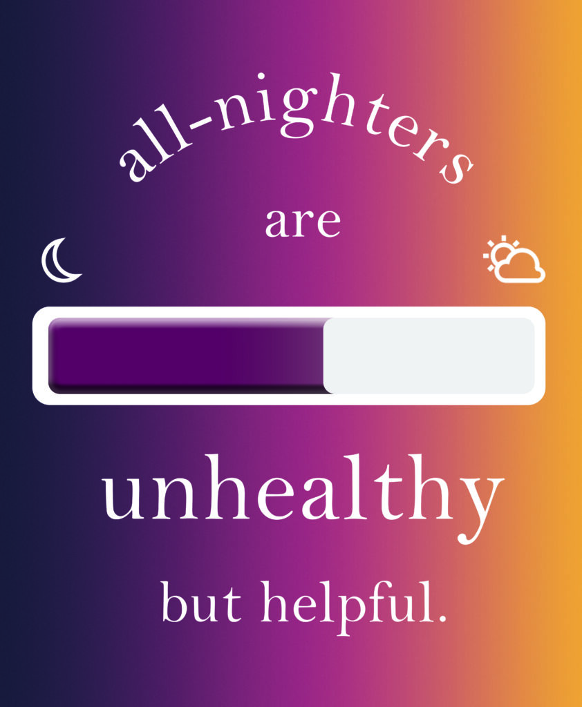
Advice to first year university students on my course.
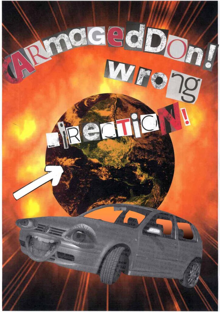
dada style poster
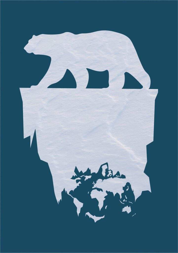
negative space
spicy cheese appreciation society
In this university project, the brief was ‘appreciation society’ where we had to choose something we feel needs more appreciation in the world. I picked spicy cheese because at the time, I was obsessed with this cheddar cheese that had peppers in it and I’d just eat it plain or put it in burgers – which was really delicious. This was the logo I created for my society. At first I had a red to yellow gradient, inspired by y2k logos. However, it just didn’t look good, just a bit amateur. I wanted my logo to be basic and obvious and I succeed in that.
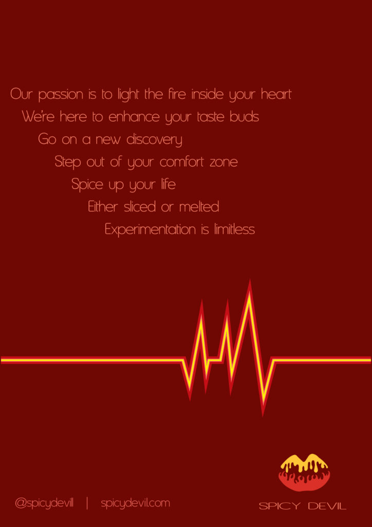
For this brief, I also had to create a manifesto. I really had to idea what to write and I remember getting really stressed the night before we had to read aloud to the class. Despite a sleepless night, my lecturer said mine was good so I should’ve been more confident in myself.
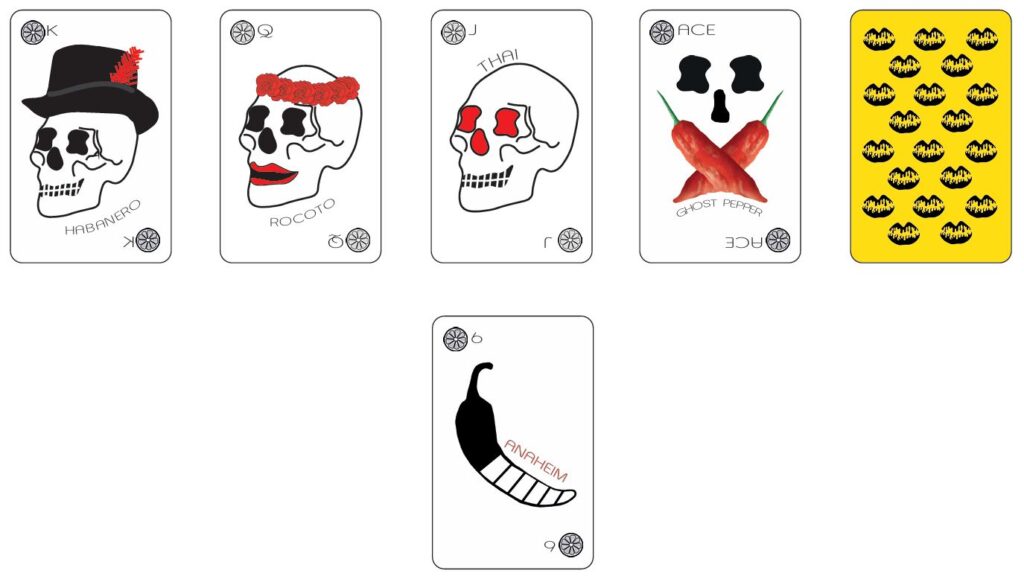
Also I had to make playing cards so my concept was using the Scoville scale, with the King card being the hottest pepper. I thought that skulls were fitting. I didn’t finish these cards but I’d love to re-illustrate them because they’re mega basic right now.
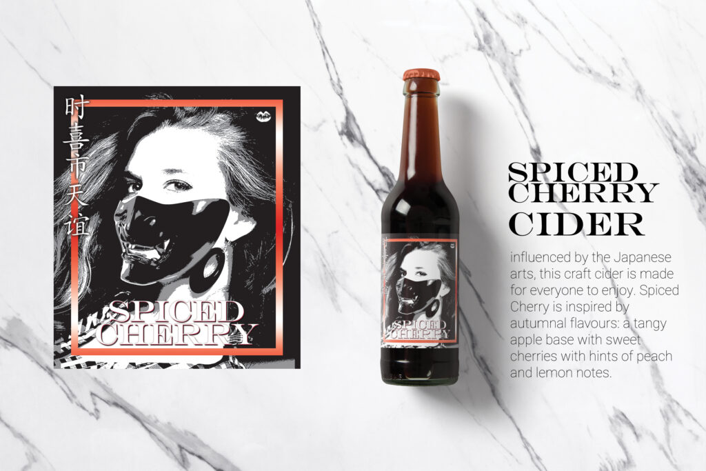
After this project, we could take a component from our design and reinvent it. So because I didn’t finish the playing cards, I would branch out and do packaging design instead. Using the same logo, I created a label inspired by Japanese masks, keeping with the spicy theme.
interactive screen design
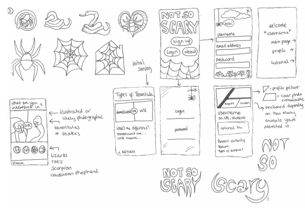
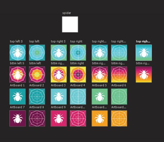
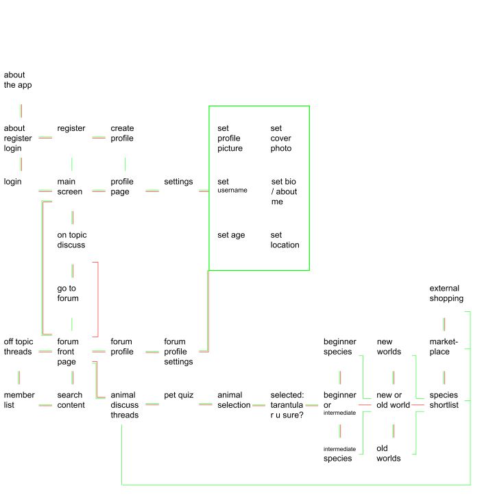
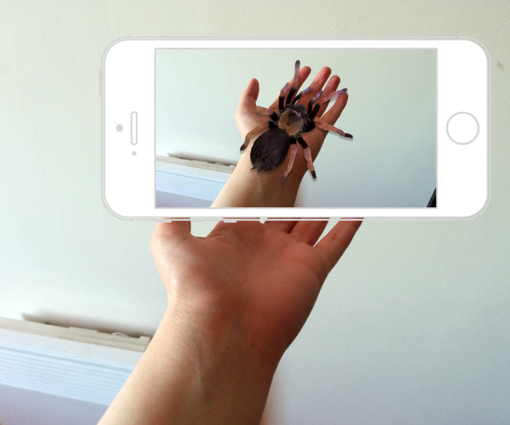
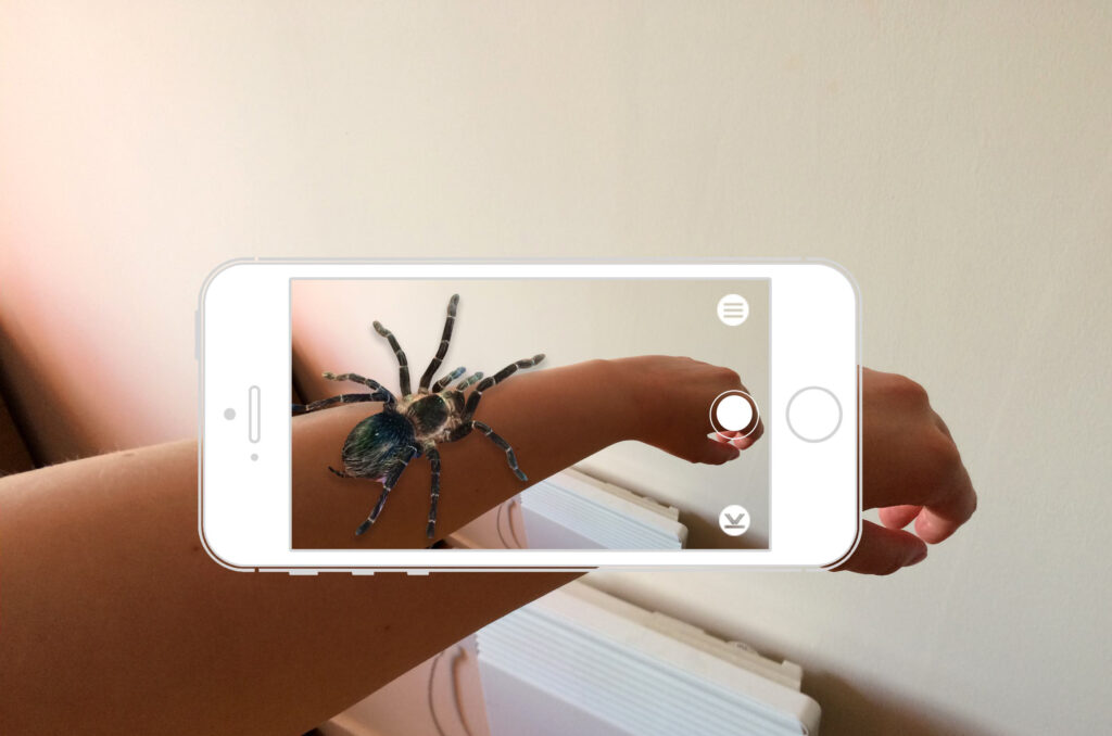
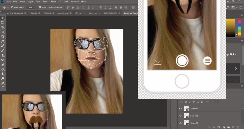
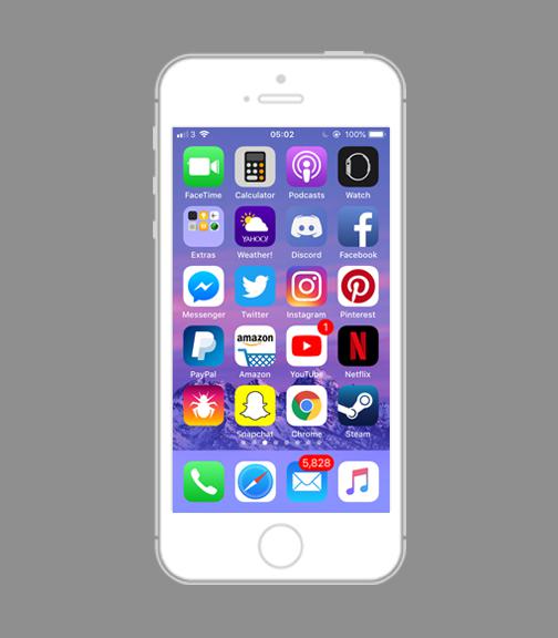
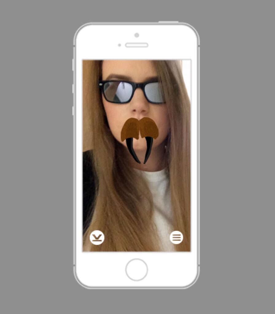
In this module, I explored app design and explored UI/UX design for the first time. For my brief, I chose to make an app for people who suffer from arachnophobia. At this point, I became really interested in spiders, mostly tarantulas. The purpose was to bring awareness to society that these creatures aren’t that harmful and that they do good in our houses. Of course, there are some species that more dangerous to humans but they aren’t really found near humans or in the UK.
For my project, I called my app ‘Face Your Fears’ where the app would also have an augmented reality feature where the user would point their phone camera at a wall or surface and a spider would appear as if it was there in real time.

women in wartime and after – client brief
In my second year, we had to group up as we had a real client’s brief this time. Matthew Townshend Productions, wanted us to create a marketing campaign; Women in Wartime and After, to call and collect stories from Suffolk women and their families about their part in the war effort and the years after.

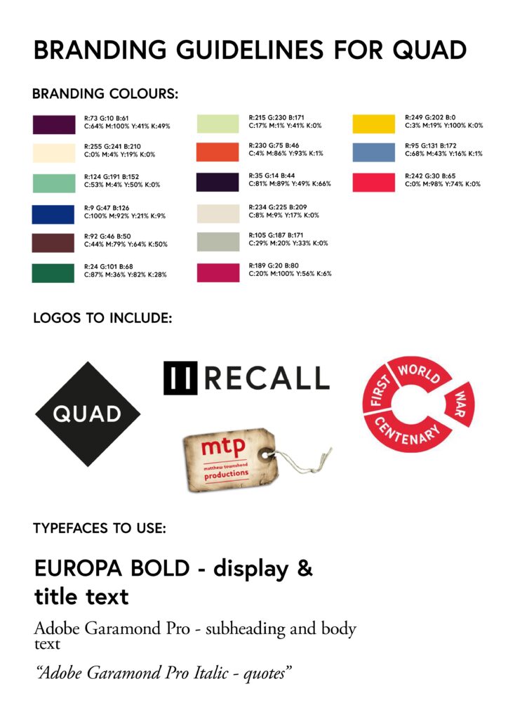
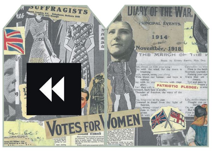
Our campaign was called Recall, with a pause symbol for us to take time to remember those who served in this time but also to celebrate the women who worked for the country. Our group brand was called Quad, simply because there were four of us.
We were inspired by the MacMillan coffee mornings the charity does, so we wanted to incorporate a similar theme into our campaign.
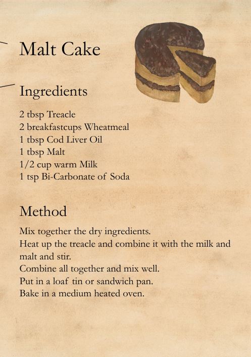
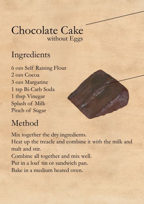
We set roles in between each other. I was an illustrator but also I did a lot of the costing analysis. We wanted to create a small box that had gifts inside such as tea bags, sweets, recipe cards from the war that families can recreate at home, postcards etc.
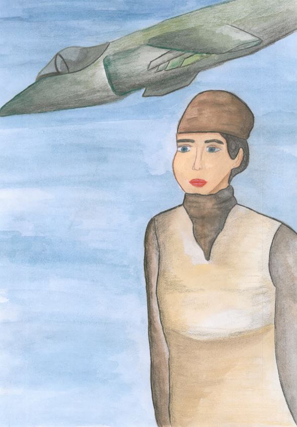
Ideally if I were doing this project solo, I would have wanted to honour the women working during the war. The client did not want illustrations, only photographs but I would have wanted it more powerful. I illustrated a poster of a woman with a fighter jet behind her, as if she were a mechanic.
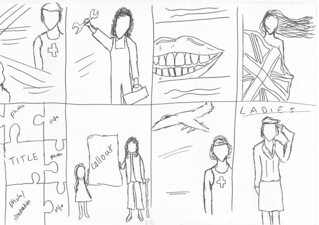
Looking back on this brief, our group became really disjointed. There were issues and I don’t think there was a main purpose for this campaign besides just asking women for their stories. We could have done, for example, the service women of the war. At the end, we set up our campaign to present to the client, only two of us. The client’s feedback to me was that he was really impressed with the costing research, which I’ve never really done before. I had used a couple different printing companies but I wanted good quality paper for a lower bulk print price. The client did choose his favourite campaign, which wasn’t us but it was a learning experience for sure!
stonemasonry
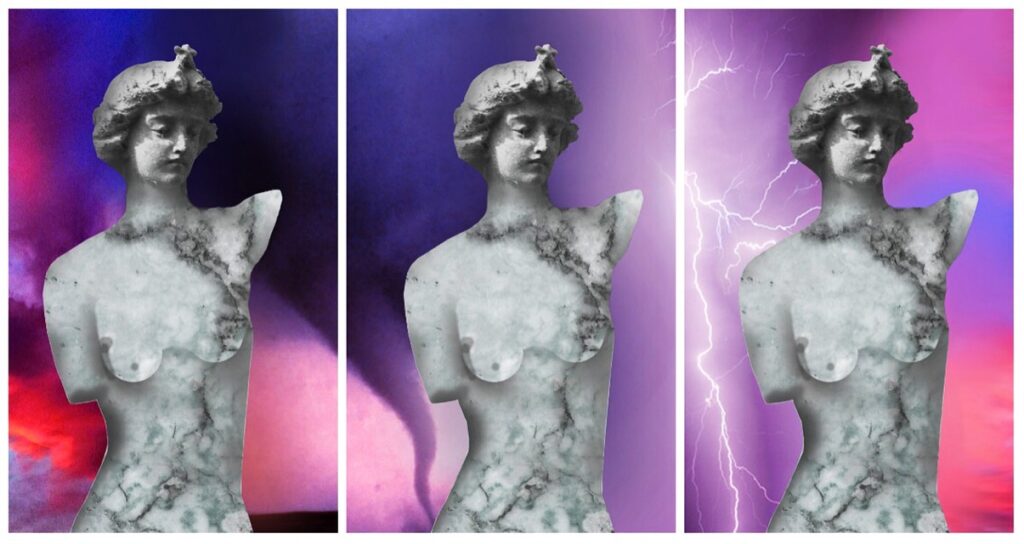
For this project, everyone had to pick a bit of paper out of a bowl; each had a different profession. I got stonemasonry. I could’ve done so much better for this outcome!
typographic explorations
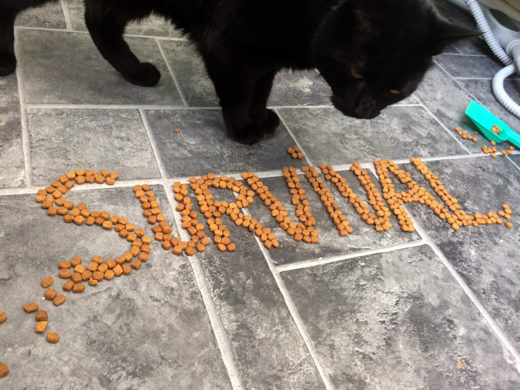
In this brief, we were to explore typography away from digital media.
modernism vs postmodernism essay
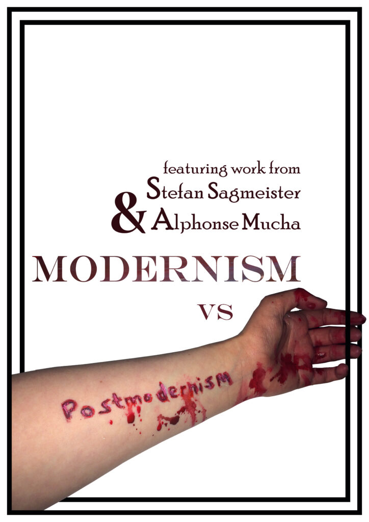
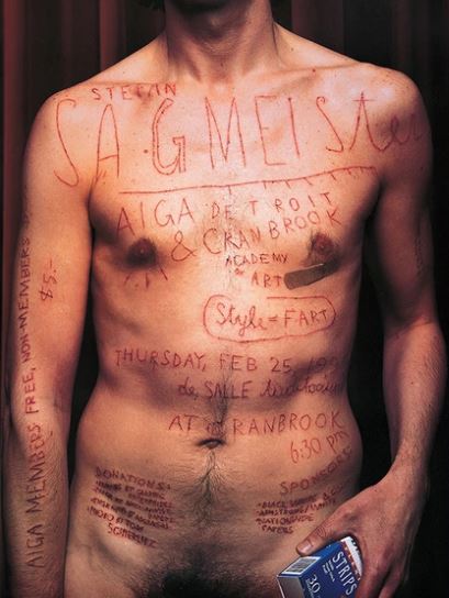
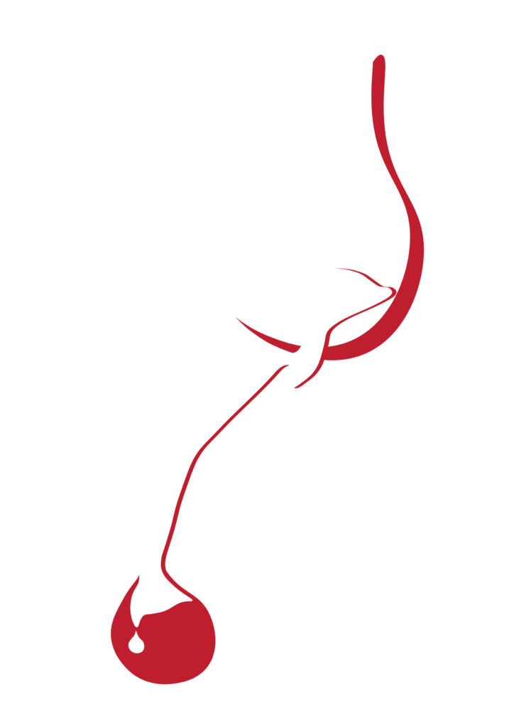
This was the first essay I had to write for my degree. This front cover design for my essay was inspired by Stefan Sagmeister when he cut words straight into his body for a project. Obviously I didn’t want to go to that extreme so I used acrylic paint to give the effect of blood.
dissertation
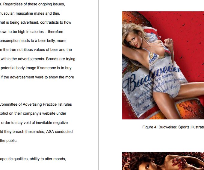
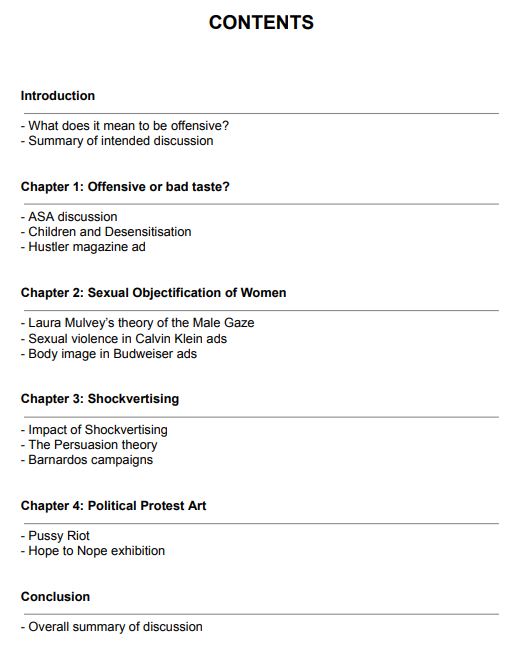
For my final year, my dissertation was on Offensive Design in Advertising. I am particularly interested in controversial designs that were chosen to be published.

